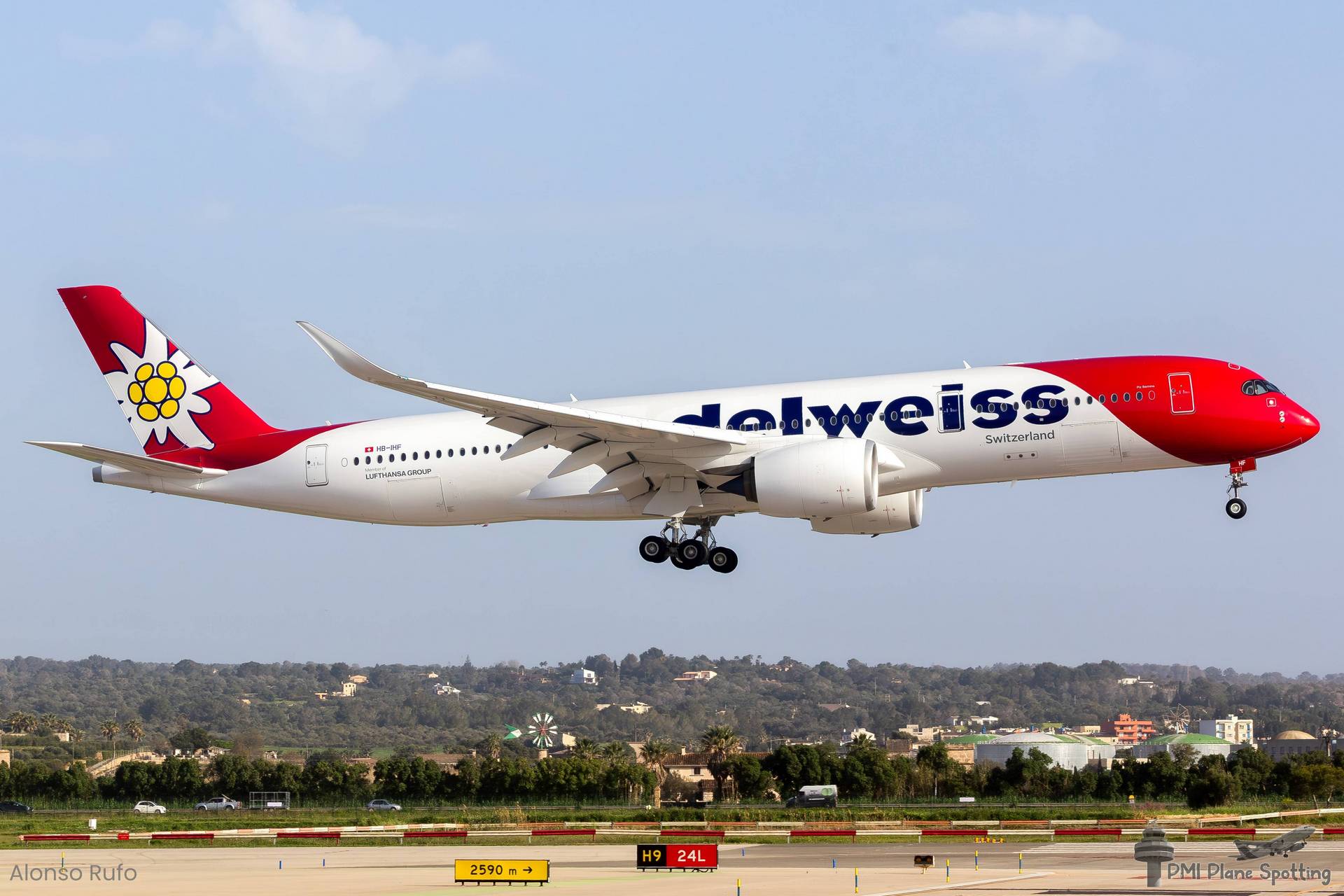
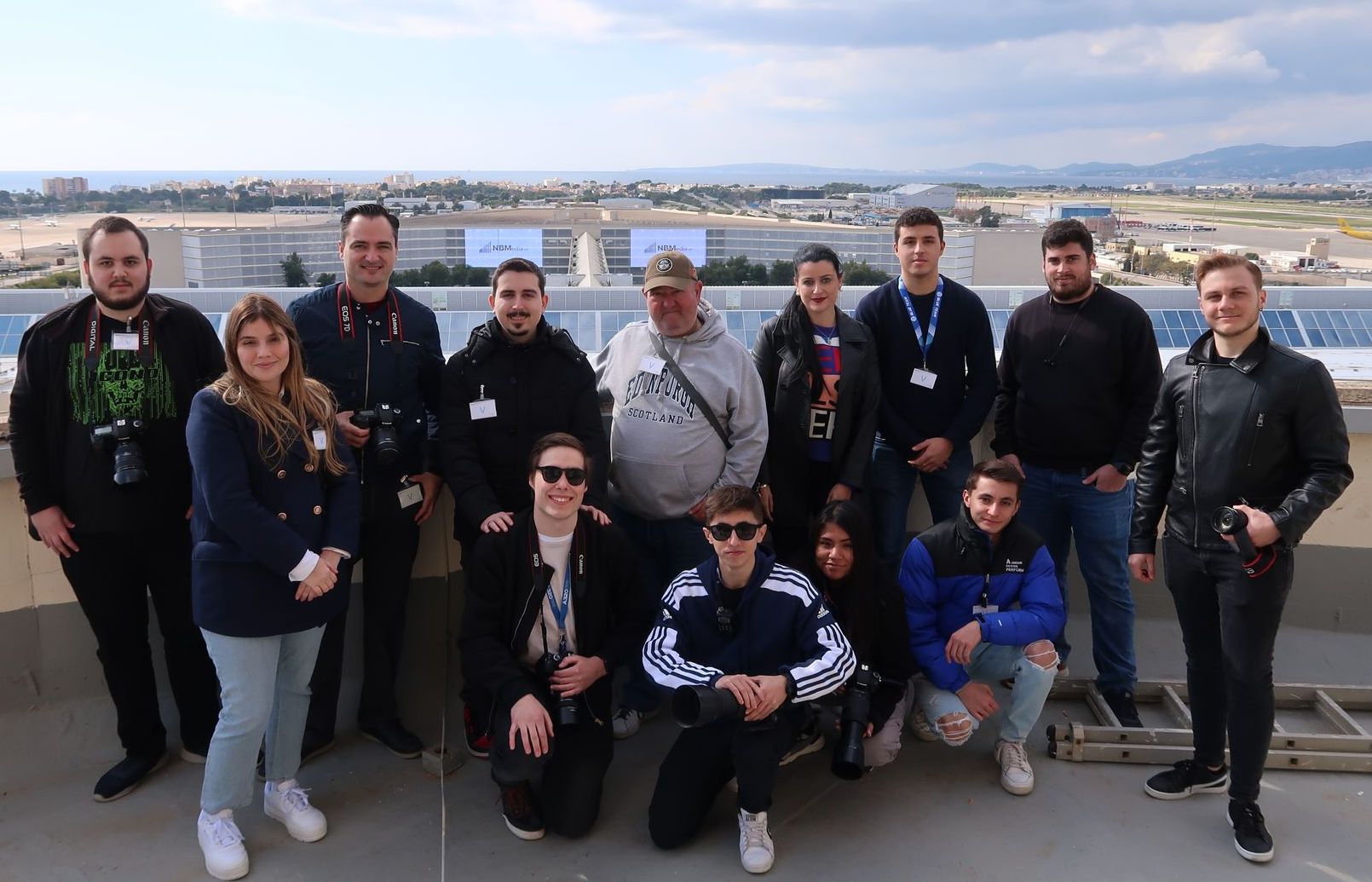
 .u-section-1 {
  background-repeat: no-repeat, no-repeat;
  background-image: linear-gradient(to bottom, rgba(0, 0, 0, 0.5), rgba(0, 0, 0, 0.5)) no-repeat 50% 50% / cover;
  background-position: 50% 50%, 50% 50%;
  background-size: cover, cover;
}

.u-section-1 .u-sheet-1 {
  min-height: 532px;
}

.u-section-1 .u-layout-wrap-1 {
  width: 1851px;
  margin: 63px -355px 60px;
}

.u-section-1 .u-layout-cell-1 {
  min-height: 406px;
}

.u-section-1 .u-container-layout-1 {
  padding: 30px 30px 0;
}

.u-section-1 .u-image-1 {
  height: 271px;
  width: 676px;
  margin: 0 0 0 auto;
}

.u-section-1 .u-social-icons-1 {
  white-space: nowrap;
  height: 44px;
  min-height: 16px;
  width: 172px;
  min-width: 68px;
  margin: 28px 0 0 auto;
}

.u-section-1 .u-icon-1 {
  height: 44px;
}

.u-section-1 .u-icon-2 {
  height: 44px;
  color: rgb(47, 102, 254) !important;
}

.u-section-1 .u-icon-3 {
  height: 44px;
  color: rgb(205, 23, 164) !important;
}

.u-section-1 .u-layout-cell-2 {
  min-height: 406px;
}

.u-section-1 .u-container-layout-2 {
  padding: 18px 30px;
}

.u-section-1 .u-text-1 {
  font-family: Fredoka;
  font-weight: 700;
  font-size: 2.5rem;
  margin: 12px auto 0 2px;
}

.u-section-1 .u-text-2 {
  font-weight: 700;
  font-style: italic;
  font-size: 1.25rem;
  margin: 20px auto 0 2px;
}

@media (max-width: 1199px) {
  .u-section-1 .u-sheet-1 {
    min-height: 274px;
  }

  .u-section-1 .u-layout-wrap-1 {
    position: relative;
    width: 940px;
    margin-left: 0;
    margin-right: 0;
  }

  .u-section-1 .u-layout-cell-1 {
    min-height: 532px;
  }

  .u-section-1 .u-image-1 {
    inset: auto;
    height: 139px;
    width: 347px;
  }

  .u-section-1 .u-layout-cell-2 {
    min-height: 206px;
  }
}

@media (max-width: 991px) {
  .u-section-1 .u-sheet-1 {
    min-height: 222px;
  }

  .u-section-1 .u-layout-wrap-1 {
    width: 720px;
  }

  .u-section-1 .u-layout-cell-1 {
    min-height: 660px;
  }

  .u-section-1 .u-container-layout-1 {
    padding-bottom: 0;
  }

  .u-section-1 .u-image-1 {
    height: 101px;
    width: 252px;
  }

  .u-section-1 .u-social-icons-1 {
    margin-top: 12px;
    margin-right: auto;
  }

  .u-section-1 .u-layout-cell-2 {
    min-height: 100px;
  }
}

@media (max-width: 767px) {
  .u-section-1 .u-sheet-1 {
    min-height: 446px;
  }

  .u-section-1 .u-layout-wrap-1 {
    width: 540px;
  }

  .u-section-1 .u-layout-cell-1 {
    min-height: 595px;
  }

  .u-section-1 .u-container-layout-1 {
    padding-left: 10px;
    padding-right: 10px;
  }

  .u-section-1 .u-container-layout-2 {
    padding-left: 10px;
    padding-right: 10px;
  }

  .u-section-1 .u-text-1 {
    font-size: 2.0833333333333335rem;
  }

  .u-section-1 .u-text-2 {
    font-size: 1.1111111111111112rem;
  }
}

@media (max-width: 575px) {
  .u-section-1 .u-sheet-1 {
    min-height: 337px;
  }

  .u-section-1 .u-layout-wrap-1 {
    width: 340px;
  }

  .u-section-1 .u-layout-cell-1 {
    min-height: 217px;
  }

  .u-section-1 .u-image-1 {
    margin-right: auto;
  }

  .u-section-1 .u-social-icons-1 {
    margin-top: 20px;
  }

  .u-section-1 .u-text-1 {
    font-size: 1.666666666666667rem;
  }
} .u-section-2 {
  background-position: 50% 50%;
  background-repeat: no-repeat;
  background-size: cover;
}

.u-section-2 .u-sheet-1 {
  min-height: 627px;
}

.u-section-2 .u-blog-1 {
  margin-bottom: 19px;
  margin-top: 0;
}

.u-section-2 .u-repeater-1 {
  grid-auto-columns: calc(50% - 5px);
  grid-template-columns: repeat(2, calc(50% - 5px));
  min-height: 608px;
  grid-gap: 10px;
}

.u-section-2 .u-container-layout-1 {
  padding: 30px;
}

.u-section-2 .u-text-1 {
  margin-left: 0;
  margin-right: 0;
  margin-top: 43px;
}

.u-section-2 .u-image-1 {
  height: 236px;
  margin-top: 20px;
}

.u-section-2 .u-text-2 {
  margin-bottom: 0;
}

.u-section-2 .u-container-layout-2 {
  padding: 30px;
}

.u-section-2 .u-text-3 {
  margin-left: 0;
  margin-right: 0;
  margin-top: 43px;
}

.u-section-2 .u-image-2 {
  height: 236px;
  margin-top: 20px;
}

.u-section-2 .u-text-4 {
  margin-bottom: 0;
}

@media (max-width: 1199px) {
  .u-section-2 .u-sheet-1 {
    min-height: 431px;
  }

  .u-section-2 .u-repeater-1 {
    min-height: 500px;
  }
}

@media (max-width: 991px) {
  .u-section-2 .u-sheet-1 {
    min-height: 330px;
  }

  .u-section-2 .u-repeater-1 {
    grid-auto-columns: calc(100% - 0px);
    grid-template-columns: 100%;
  }
}

@media (max-width: 767px) {
  .u-section-2 .u-sheet-1 {
    min-height: 248px;
  }

  .u-section-2 .u-repeater-1 {
    grid-auto-columns: 100%;
  }

  .u-section-2 .u-container-layout-1 {
    padding-left: 10px;
    padding-right: 10px;
  }

  .u-section-2 .u-container-layout-2 {
    padding-left: 10px;
    padding-right: 10px;
  }
}

@media (max-width: 575px) {
  .u-section-2 .u-sheet-1 {
    min-height: 156px;
  }

  .u-section-2 .u-repeater-1 {
    min-height: 518px;
  }
}.u-section-3 .u-sheet-1 {
  min-height: 463px;
}

.u-section-3 .u-text-1 {
  font-family: Fredoka;
  font-weight: 700;
  font-size: 2.5rem;
  width: 329px;
  margin: 31px auto 0;
}

.u-section-3 .u-text-2 {
  font-family: Fredoka;
  font-weight: 700;
  letter-spacing: 0px;
  line-height: 1.2;
  margin: 24px 0 0;
}

.u-section-3 .u-form-1 {
  height: 436px;
  margin: 27px 0 15px;
}

.u-section-3 .u-form-group-1 {
  margin-left: 0;
}

.u-section-3 .u-input-1 {
  font-family: Fredoka;
  background-image: none;
}

.u-section-3 .u-form-group-2 {
  margin-left: 0;
}

.u-section-3 .u-input-2 {
  font-family: Fredoka;
  background-image: none;
}

.u-section-3 .u-text-3 {
  margin-left: 0;
  font-family: Fredoka;
}

.u-section-3 .u-form-group-4 {
  margin-left: 0;
}

.u-section-3 .u-form-group-5 {
  margin-left: 0;
}

.u-section-3 .u-btn-1 {
  font-weight: normal;
  font-size: 1rem;
  font-family: 'Open Sans',sans-serif;
  background-image: none;
  display: inline !important;
  padding: 0;
}

.u-section-3 .u-btn-2 {
  --radius: 10px;
  background-image: none;
  font-family: Fredoka;
  font-size: 1.125rem;
  padding: 9px 73px 11px;
}

@media (max-width: 1199px) {
  .u-section-3 .u-form-1 {
    margin-right: initial;
    margin-left: initial;
  }
}

@media (max-width: 767px) {
  .u-section-3 .u-text-1 {
    font-size: 2.25rem;
  }
}

@media (max-width: 575px) {
  .u-section-3 .u-text-1 {
    font-size: 1.875rem;
  }
}